
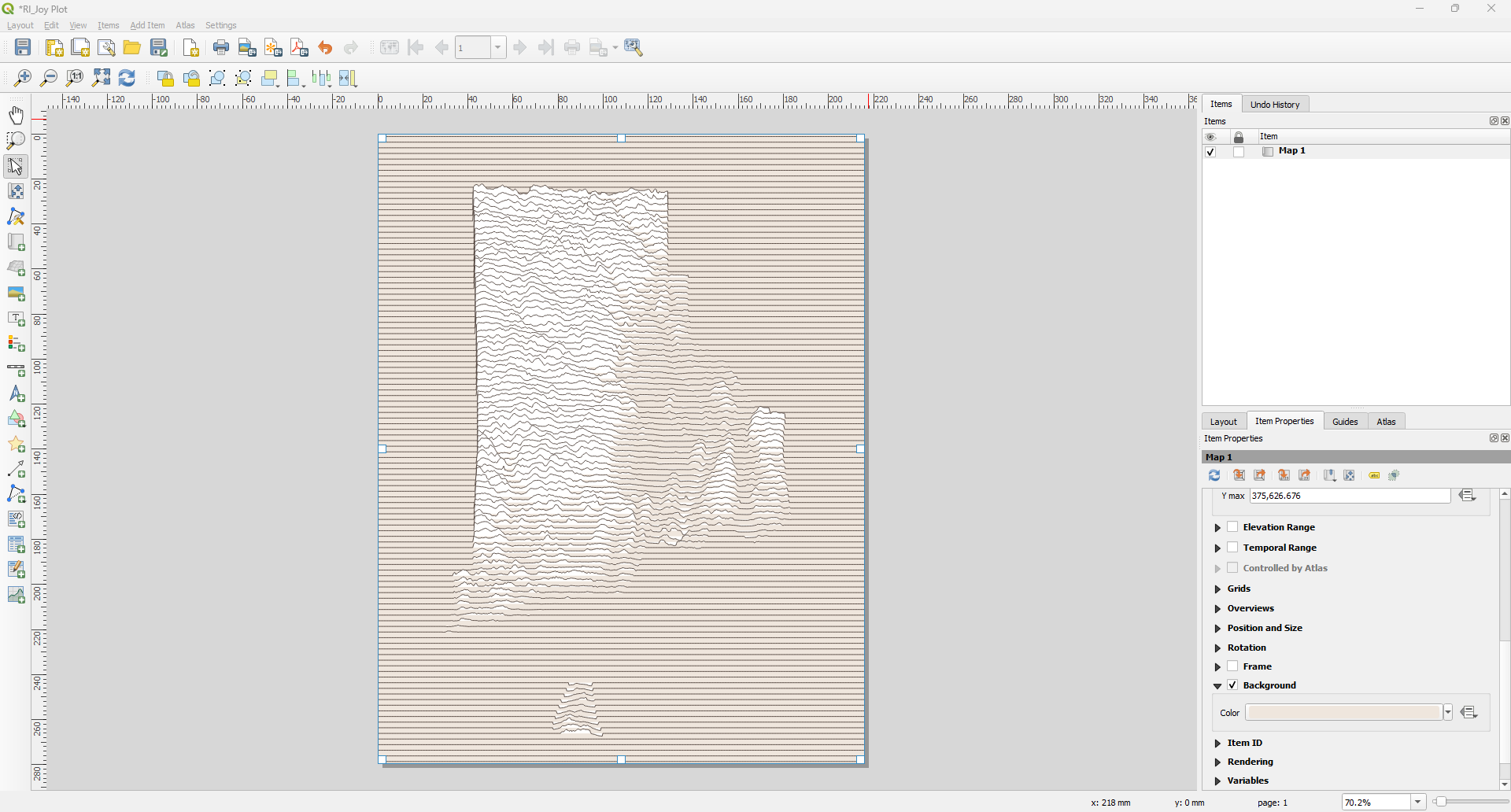
In this Workflow, I will show you how I created a Joy Plot style map from the 2025 30DayMapChallenge. There are multiple ways to achieve this; however, this method worked best for me.
Tools Needed
- QGIS (I’m running 3.40.8)
- DEM of your Area of Interest (AOI)
- AOI Boundary (optional)
Note: Assumptions
There are a few assumptions in this workflow. One, you are familiar with QGIS and you can manage your DEMs as needed (merge, clip, reproject, etc).
Workflow Overview
- Add & Prep DEM
- Create Grid
- Sample Raster
- Translate
- Points to Path
- Symbolize
Add & Prep DEM
Add DEM raster and modify as needed (merge, clip, reproject). We will use Rhode Island in this workflow. The DEM is from the NOAA Coastal Relief Model that I clipped to the Rhode Island state boundary from US Census Bureau 20 million:1 state boundaries. This boundary generalizes the Narragansett Bay, which is helpful in this instance as the CRM DEM includes bathymetry.

Create Grid (Vector Creation)
[QGIS Help Link]
Next, we need to create a point grid. Open the Create Grid tool (Vector Creation). Use Point for Grid type, select either your DEM or boundary for the Grid extent. For Horizontal spacing, I used 100 meters; however, this will vary by the extent of your map and how detailed you want your plot lines to be. For Vertical spacing, we will use a 10x vertical spacing (in this case, I used 1,000 meters).
- Grid type:
- Grid extent:
- Horizontal spacing: 100 meters
- Vertical spacing: 1000 meters (10x Horizontal spacing)

Results

Sample Raster Values (Raster Analysis)
[QGIS Help Link]
Next, we will use the Sample Raster Values tool from the Raster Analysis toolbox. Select the output of the Grid points
- Input layer: Grid points
- Raster layer: DEM
- Output column prefix: ELEV (optional)
Note: If you don’t want the overruns, I recommend clipping your data before the next step!
Translate (Vector Geometry)
[QGIS Help Link]
Now we will offset the sampled points by elevation values.
- Input: Sample Raster Values output
- Offset Distance (y-axis): Expression

In this example, I multiplied the elevation value (SAMPLE_1) by 50 to give it an exaggerated effect. Your results may vary, so you will need to experiment a bit.

Results

Points to Path (Vector Creation)
[QGIS Help Link]
Finally, we need to convert our points to lines. For this step, we will use the Points to Path geoprocessing tool.
- Input layer: Translated output
- Path group expression: top
- Paths: [optional]

Results

Symbology
We can adjust the symbology of our Joy Plots. We will add a “background” so the bottom lines or plots obscure the top lines, giving the map a 3D like effect.
In the Paths (or Joy Plot lines) layer properties:
Add a new symbol and move it below the original.

Select the new Simple Line symbol and change the symbol layer type to Geometry Generator and change the Geometry type to Polygon.

Enable the Control feature rendering order option (bottom of the window) and open the Define Order window.

Set the Expression to the top attribute and the order to Descending.

Change the Simple Line symbol in the Geometry Generator symbol to Simple Fill.

Change the Fill color to white (or a color of your choice) and remove the Stroke outline.

Apply.
Result


Changing the background color in the map layer will give the joy plots a more dynamic effect.

Final Map!

And there you have it. If you have any questions, feel free to leave them in the comments.
References
https://www.helenmakesmaps.com/post/how-to-joy-plot
One response to “Create a Joy Plot Map in QGIS”
[…] Create a Joy Plot Map in QGIS […]